Sales funnels aren’t just for million-dollar blogs and businesses. Your sales funnel design is how you grow your email list and make money blogging. Here’s how to design a blog sales funnel that converts, no matter your blog’s size!
We’re not going to lie; we seriously underestimated exactly how much work goes into blogging.
It’s easy to think that starting a blog requires only writing good content, publishing a few Pinterest pins or social media posts, and boom! Instant traffic.
But there’s much more to it than that. Like, x100 more.
A common theme we’ve seen lately is newer bloggers not realizing how much DESIGN goes into blogging. Almost everything we do requires some kind of design.
Ready to nail your product launch? Get our FREE Product Creators QuickStart Kit with a checklist, cheatsheet, and Canva design template so you can create a digital product for your blog!
From our Pinterest pins and lead magnets to social media posts, products, and even landing pages, they all require DESIGN.
It wasn’t until we really started getting into the strategy of blogging that our business took off.
A blog strategy didn’t come naturally to us. It took us a lot of time, trial and error, mistakes, investments, and constant learning to nail ours down.
We can do the design part of it all day, but putting it all together in a way that clicks? Well, let’s just say that was definitely one of our biggest challenges.
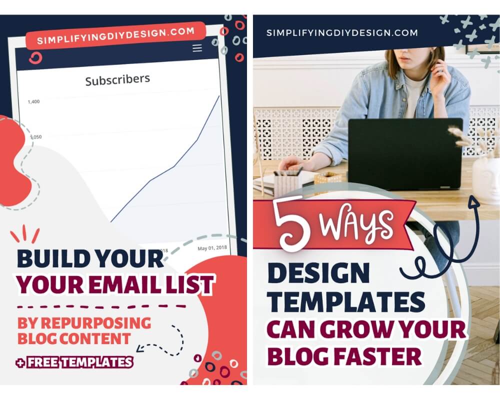
REMEMBER THIS POST LATER! PIN IT TO YOUR FAVORITE PINTEREST BOARD!⬇
We had to examine our blog sales funnel in a completely different light, analyzing the intricacies of every step to determine where our readers would go next.
And you know what we found?
If your design doesn’t stop your reader in their tracks, you won’t get the click.
They’ll never step into your beautifully crafted blog sales funnel to hand over their email address, let alone make a purchase that funds your blog.
Table of Contents
- 1 STEP ONE: THE IMAGE (ENTRY POINT)
- 2 STEP TWO: THE LEAD MAGNET
- 3 STEP THREE: THE OPT-IN PAGE
- 4 STEP FOUR: THE TRIPWIRE
- 5 STEP FOUR (ALTERNATIVE): THANK YOU PAGE
- 6 STEP FIVE: THE WELCOME EMAIL SEQUENCE
- 7 STEP SIX: THE PRODUCT DESIGN
- 8 STEP SEVEN: THE SALES PAGE
- 9 STEP EIGHT: THE SALES SEQUENCE
- 10 STEP NINE: THE UPSELL
- 11 WHAT DO THESE BLOG SALES FUNNEL STEPS HAVE IN COMMON?
- 12 RESOURCES MENTIONED IN THIS POST:
- 13 TRY CANVA PRO FREE FOR 30 DAYS
STEP ONE: THE IMAGE (ENTRY POINT)
Most of the time, unless someone finds you on Google, the entry point to your blog is visual.
This could be a Facebook post, Pinterest pin, Instagram post, or something similar.
Even Facebook or Pinterest ads are, again, visual.
Gone are the days of writing a blog post and putting it out to the world with an ugly pin and a catchy title. (Yes, it was actually as easy as that!)
Now we’re competing with colors, videos, text that pops, and so many distracting elements such as ads, pop-ups, and even outside distractions like dogs and kids.
Your design needs to stop the scroll. It needs to catch attention.
Related Post: Anatomy of the Perfect Pinterest Pin Design
Even more than that, it needs to be professional, readable, bright, and relatable. No pressure, right?
TIPS TO INCREASE CONVERSIONS
- Use stock photos unless your content is specific to your creations (food, craft, etc.)
- Choose photos that are light, bright, and relatable (cheesy won’t get clicks)
- Keep font size in mind; If it’s too small to read on a cell phone, they won’t click
- Test different titles to see which one clicks with your ideal reader
- Use design elements like banners or arrows to draw attention to CTA’s
- Keep your ideal reader in mind when choosing design elements
- Use a design template to save time
To keep our entry points consistent, we use a pack of templates that have already been designed to match our brand. That way, we only have to swap out the image and update the text.
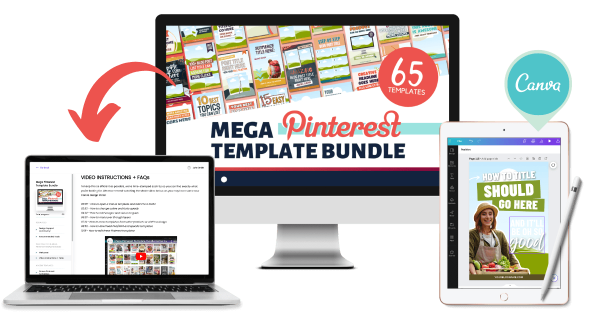
If you want to build your own pack of branded templates, our MEGA Pinterest Template Bundle is just what you need. Choose from 65+ grid, collage, and mockup-style Pinterest templates
We’ve combined grid, collage, and mockup style pin designs for MEGA variety and MAX conversions! Get it NOW for only $27!
STEP TWO: THE LEAD MAGNET
The next stage of a sales funnel design is your lead magnet.
This is also called a content upgrade or freebie; whatever you’re offering for free in exchange for an email address.
There are several ways to brainstorm lead magnet ideas. Since everyone’s blog and mission are different, we’ll divide the list into two categories.
IF YOU HAVE ANY KIND OF PAID OFFER
If you already have a paid offer, work backward! You need to start with the paid offer, even if it’s an affiliate product you’ll promote in your welcome email (which we’ll touch on later).
Ask yourself different questions about your reader and your paid offer:
- What problem does the paid offer solve?
- Where does my reader need to be in order to know that they have that problem?
- What kind of information do they need prior to being ready to get that problem solved?
- What’s another problem they might have BEFORE being ready for the paid offer that I can solve?
Let the paid offer guide your decision. The more closely related, the better the conversion.
IF YOU DON’T HAVE ANY KIND OF PAID OFFER
If you don’t have any kind of pair offers, let’s start by doing a quick content audit. What are your top posts and blog topics? How broad is your blog?
We’re firm believers that a blog can be broad, but the email list cannot.
Related Post: 17 Content Upgrades to Grow Your Email List
That’s why we always recommend framing your lead magnets in a way that speaks to a specific person (even if they’re about different things).
Do you see how our lead magnet ties perfectly with this part of the blog post? We’re more likely to get an email address in exchange for our freebie because it directly relates to our content.
It all comes back to your target audience (or avatar). What do they want, and WHY do they want it?
Once you’ve looked at your top posts, think about the next logical step or how you can expand on the content in an actionable way.
We discuss this in depth in our Tripwire Deep Dive Workshop. It’s available now for only $27!
STEP THREE: THE OPT-IN PAGE
Now that you have written your blog post, your social media or Pinterest images are ready, and your lead magnet is created, it’s time to create a dedicated opt-in page or form.
If you’re a beginner blogger, start this stage of your sales funnel design with a FORM embedded in your blog posts.
Related Post: How to Grow Your Email List as a New Blogger
For more experienced bloggers, landing pages are great for sending traffic directly to your offer via Pinterest, YouTube, social media, or paid advertising.
OPT-IN FORMS
Our email service provider of choice is ConvertKit, and we cannot recommend it enough. They have nine ‘inline’ (forms within a blog post) styles to choose from.
It’s so simple to use yet has a ton of features that’ll really elevate your blog sales funnel.
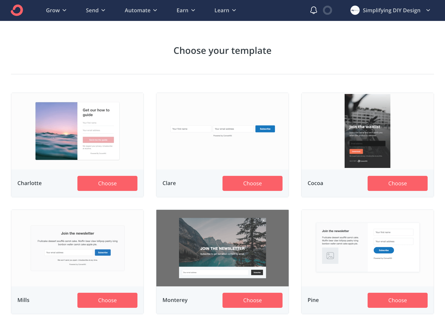
Regardless of the tool you use, be sure to include a mockup-style graphic on your form so your readers know exactly what they’re getting in exchange for an email address.
OPT-IN PAGES
You may have seen a few opt-in pages that vary in length. Some are very short (to limit distractions), and some are a bit longer to include social proof, information about the creator, etc.
If you’re just starting out, don’t worry about the extra noise. You’ll add that as you establish brand recognition and trust amongst your readers.
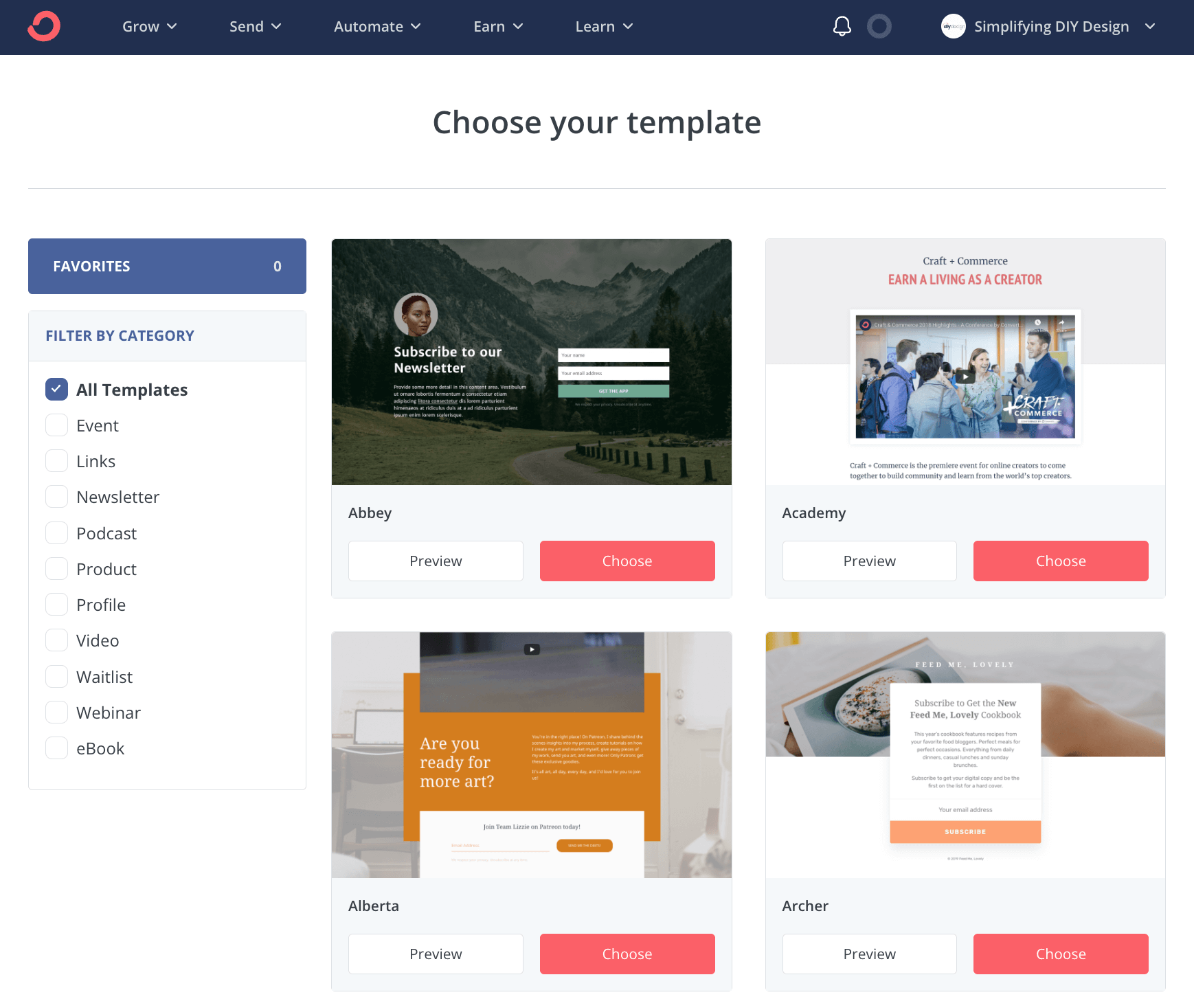
ConvertKit has 50+ landing page designs to choose from. You can also edit the photos, fonts, and colors to match your brand.
When setting up your opt-in page, keep in mind:
- Headline
- Visual element (usually a mockup-style graphic of the lead magnet)
- Offer itself
- Button
- How it looks on mobile (this is easily forgotten!)
Other landing page options are Elementor and Brizy (both are FREE and available for WordPress users).
We’ve been using LeadPages for years and love it.
It’s (very) user-friendly and 100% customizable, whether you’re creating a basic opt-in page or full sales pages, timed offers, or redirects. Try LeadPages FREE for 14 days here!
If you use Elementor or LeadPages, be sure to check out our Confident Funnels. It’s our complete funnel system with done-for-you landing page templates in three different designs!
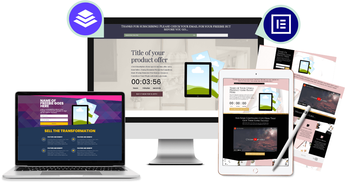
STEP FOUR: THE TRIPWIRE
You’ve created your entry point, lead magnet, and opt-in method. Now, it’s time to monetize, especially if you plan to use paid advertising to grow your email list.
A tripwire is a low-cost, quick-win type of product that’s offered right after someone signs up for your email list.
They’re redirected to a ‘Thank you’ page that lets them know their freebie is on the way and offers them a special one-time offer (OTO).
Learn everything there is to know about tripwire products in our Tripwire Deep Dive Workshop NOW for just $27!
The most profitable tripwires are HIGHLY RELATED to the lead magnet offer.
Additionally, you want a visual element ‘above the fold’. Your subscriber won’t read the rest of the sales page if it doesn’t immediately grab their attention.
Visual elements to include above the fold are:
- Product mockup
- Countdown timer (that redirects so it’s truly a one-time offer)
- Button that pops!
We’ll use one of the tripwire page templates from our Confident Funnels as an example. You can also view the entire page by clicking here.
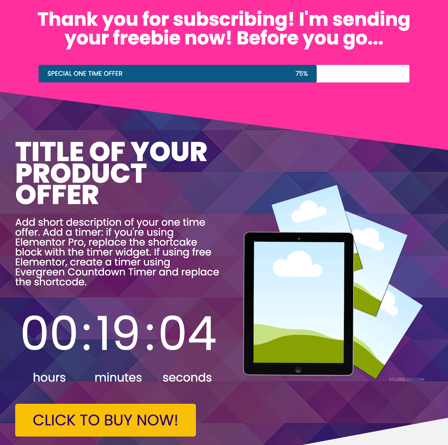
This entire section is ‘above the fold’, immediately visible without scrolling down the page. The product mockup, countdown timer, and buy button are in immediate view to grab attention.
Related Post: Profitable Tripwire Product Ideas for Your Blog
Tripwire purchases are impulse buys (hence the timer). That’s why the offer needs to be very compelling and valuable at a ‘no-brainer’ price.
Be sure to double-check how your tripwire page looks on tablet and mobile devices as well!
STEP FOUR (ALTERNATIVE): THANK YOU PAGE
If you don’t have a tripwire offer, you can still optimize your ‘Thank you’ page for maximum value and connection.
Ways to provide value and establish a connection on your thank you page:
- Short story about you and your ‘why’ (with headshot)
- Links to your best articles they might find helpful
- Create a “favorite resources” page (great for affiliate links, too)
- Promote your favorite affiliate products (like the bottom of our homepage)
- Link to your social media profiles, podcast, or YouTube channel
- Make a short value video (embed it for minimal space)
There are many ways to get creative with your thank you page!
You can also include these recommendations on your ‘Offer expired’ page if you use a tripwire.
An offer expired page redirects your subscriber after the timer expires OR if they sign up to your email list again at a later time.
See what we mean in our Tripwire Deep Dive Workshop. Dive in now for only $27!
STEP FIVE: THE WELCOME EMAIL SEQUENCE
Ironically, we usually suggest very few visual elements inside your email. We’re not huge fans of headers or lots of images inside an email for a few reasons.
If NOT done right, they can increase the chance of being tagged as spam or take too long to load, causing your reader to completely miss the image(s).
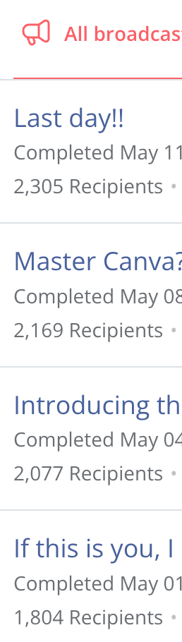
Here’s a portion of one of our emails:
We provide visuals in other ways, including colored headings, emojis, and buttons.
Now, keep in mind that we’re an agency, so we want our emails to look very professional.
If you’re the face of your blog, you may want your emails to feel like it’s coming from a friend. Some bloggers are famous for getting personal with their email lists through storytelling and value.
Connection is a ‘make or break’ piece to a sales funnel because connection helps build ‘know, like, and trust’ with your readers.
We’ve included matching email header and signature templates in our Five-Minute Brand!
Get 40 complete (and editable!) Canva brand kits PLUS dozens of matching templates for just $27 with our Five-Minute Brand!
STEP SIX: THE PRODUCT DESIGN
You’ve likely heard the phrase “the money is in the list,” but maybe you’re unsure how or why.
Use your email list to establish a connection with your readers and provide them value.
In doing so, you’ll let them know about products you’ve used or created that’ll solve a specific problem they’re having.
Related Post: 4 Common Mistakes to Avoid When Selling Digital Products
They will trust your recommendation and purchase said product because they know, like, and trust you. You’re essentially get paid to help them.
Here’s the thing, though.
What you recommend has to actually help them! The products you offer can NOT be random. The key to conversion is to quite literally make a product FOR your people.
Here’s how we made $10k in seven days with an email list of just over 2,000 subscribers.
- Grew our list with very targeted lead magnets
- Nurtured our list by emailing regularly
- Surveyed our readers to find their biggest pain points
- Made product to solve biggest pain points
- Launched said product
We didn’t create just any product or what we THOUGHT they wanted. We created exactly what THEY asked for.
Alternatively, if you don’t have your own product that you’ve made for your reader, you can still solve their problem.
Tell them about something you’ve used to solve YOUR problem that they’re presumably going through now.
Keep in mind there are some pros and cons of affiliate marketing:
- PRO: Risk-free for you; it takes no time or energy to create
- PRO: Little to no customer service issues as it’s not your product
- CON: No control of price, sales page, email follow-up sequences, customer service, etc.
Personally, we like being in control of our products, launches, flash sales, etc.
If we notice conversions starting to drop, we have data at every point of our funnels and can pinpoint where optimization is needed.
Related Post: Must-Have Graphics for Your Digital Product Launch
The only information we have about our affiliate products is the number of times a link was clicked and the number of purchases made.
We don’t know if they dropped off on the sales page or abandoned their cart. It’s complete and total reliance on the creator’s funnel to make the sale.
COMING UP WITH A PRODUCT IDEA
We always start with our unique audience along with our data. We see what topics people are responding to and what they’re asking for. We look at survey responses, questions, emails, comments, and messages.
- What are people asking for?
- What problem do they need to solve?
- Why does it matter to them that this problem gets solved?
These are the things we really focus on when generating a product idea.
Just because it’s a thing that WE think is a good idea doesn’t mean it’s going to be something my audience wants or needs. To provide real value, you need to start with your people.
That’s why we created our Product Creators Ultimate Toolbox. It’s an entire product design and launch plan that’s been “templatized,” so you can customize it to every product you create!
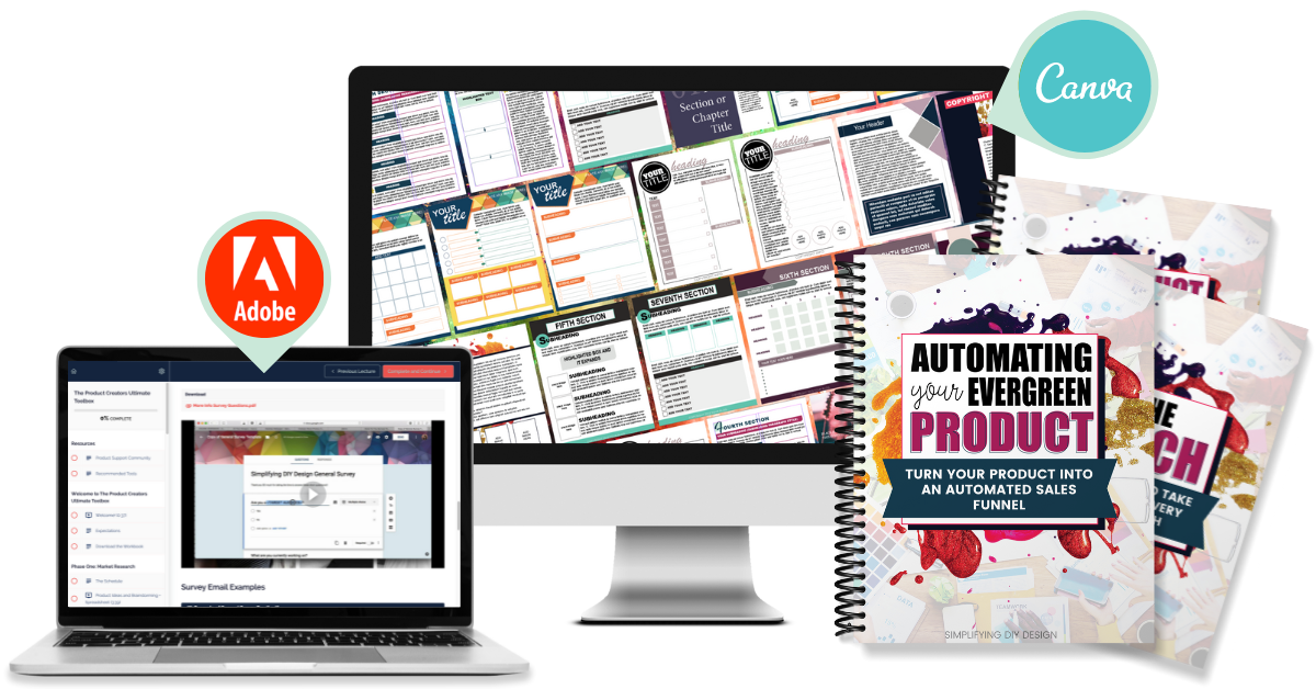
You’ll get instant access to done-for-you Canva design templates PLUS market research in 13 of the most popular niches, 320+ product ideas, surveys, sales page copy, promotional templates, and so much more.
Learn more about our COMPLETE product creation system here!
TYPES OF PRODUCTS TO CREATE FOR A SALES FUNNEL
There are so many different kinds of digital products you can make for your audience.
- Workbooks
- Workshops
- Planners
- E-courses
- E-books
- Memberships
- Coaching or other services
- Templates
- Patterns
- Downloadable files (like SVGs)
- Video training
- Journals
- Instruction guides (including cookbooks and crafts!)
- Study guides
- Spreadsheets
Once you’ve chosen your product and the format you’re going to make it in, it’s time to design.
DESIGNING A DIGITAL PRODUCT
You don’t need anything fancy to create a product for your blog sales funnel. In fact, digital products can easily be designed using simple design tools like Canva.
But before we get started, there’s one thing we want to make abundantly clear. If you sell Canva templates or products made in Canva, you must abide by Canva’s Content License Agreement.
It would behoove you to READ THIS ARTICLE FIRST before you start creating and selling products made in Canva (including Canva templates).
Here’s what we like to do before we start designing our digital product:
- Have content completely written out
- Complete inspiration session (we like to store ideas and inspo in Asana)
- Map out our product on paper (a cardboard box also works great!)
- Decide on fonts and colors (usually it’s on-brand unless it’s seasonal)
From there, we’ll search our folder of Canva templates for a design.
We’ve already designed them once. Why start from scratch every time?
Design (especially when it’s for a digital product) can be a very high ROI task but it becomes less and less “high ROI” if you take too long and get stuck.
Our Product Creators Ultimate Toolbox has 320+ Canva design templates in various product types PLUS templates for every step of the product creation (and launch!) process!
STEP SEVEN: THE SALES PAGE
Once you’ve got a product created and launched, it’s time to automate sales.
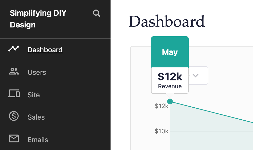
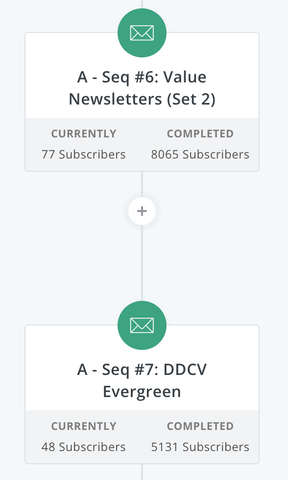
We like to add a sales sequence to the end of our welcome value emails. ConvertKit makes this simple using tools like rules, filters, and Visual Automations as shown below.
We’ve already established a connection with our new reader, and we like to offer something of higher value next.
With high value usually comes a price tag.
However, as content creators, we need to shift our focus from “feeling bad about asking for money” to “I’m able to provide value because of the fact that this person has invested in me. I can feed my family, pay the bills, and spend more time serving my readers.”
During that sales sequence, we’ll link to a sales page we designed specifically for this sequence.
The reason for that is simple: tracking.
We know that the person viewing this page only sees it because they’re in the sequence which helps track conversions on the email sales sequence itself.
Some visual elements we include are:
- Stock photos
- Product mockup images
- Countdown timers
- Testimonial graphics
- Videos
- Any graphics that might convey a special offer, flash sale, launch special, etc.
If designing a sales page is out of your purview, be sure to check out our Confident Funnels.
You’ll get instant access to done-for-you page templates for every step of your sales funnel in three unique designs!
STEP EIGHT: THE SALES SEQUENCE
After you’ve got your sales page designed for your sales sequence, it’s time to WRITE the sales sequence! Here’s the thing: this doesn’t have to be super complicated.
In fact, you can repurpose a lot of your launch especially if your product converted well. Work smarter, not harder!
We typically do 4 to 5 emails for a sales sequence, but we recommend experimenting with what works well for your audience.
Try to keep these emails simple with little to no distractions: a basic footer without links to your blog, CTA’s, affiliate program, etc.
The only thing you want someone to do is click over to the sales page. The best thing to do with an automated sales sequence is:
- Continue providing value
- Address any objections
- Give people incentive to buy (via special bonuses or early-bird discounts)
We’ve used other email service providers and none even come close to the power ConvertKit has to creating personalized sales sequences.
You don’t want to promote a product to someone who already purchased it or is in another funnel for a different product.
ConvertKit is one of the BEST tools we use in our six-figure business. Try it free for 30 days here!
STEP NINE: THE UPSELL
If you have another product that you think is a great next step or provides extra value to the one that you’re promoting, then make it an upsell!
We’ve tested this in two ways.
The first is the “upsell feature” on Teachable, which displays as a button on the confirmation page and allows people to click through and purchase the upsell.
The second way is designing a sales page (very similar to a tripwire page) that redirects after the purchase. We use ThriveCart for this and love it!
Use this page to thank them for their purchase and introduce the related product they might be interested in. This option has converted nearly 10x higher for us.
Alternatively, you can offer upsells in your post-purchase email sequence. This doesn’t have to be limited to your products but also affiliate products.
During your post-purchase sequence, provide value on how the buyer can get the MOST from your product and introduce other related offers that might help them achieve more success.
These are usually presented in more of a conversational way rather than a harder sell, like a sales sequence.
Related Post: How to Effectively Use QR Codes in Your Blog Sales Funnel
Depending on the product, QR codes are a fantastic way to continue the journey through your funnel.
Once your buyer finishes the product, they can scan the QR code to see what product you recommend next.
As you can see, there are many different ways to level up your blog sales funnel!
WHAT DO THESE BLOG SALES FUNNEL STEPS HAVE IN COMMON?
There are TWO things all of these blog sales funnel steps have in common.
First, they work to provide your subscribers with the highest amount of value possible. Second, they’re all centered around DESIGN!
Related Post: 5 Reasons Why Blog Graphics Can Impact Growth
You truly need great graphics to grow your blog. We can’t tell you how many times we’ve seen bloggers, including us, underestimate how much design goes into blogging!
Design is involved at every stage of your blog sales funnel.
- Entry point images (usually Pinterest, social media, or ads)
- Lead magnet design
- Lead magnet forms
- Lead magnet landing pages
- Tripwire design
- Tripwire sales pages
- Product design
- Design elements for your sales pages and other landing pages
- And SO much more!
We know this may seem incredibly overwhelming, but you shouldn’t tackle everything all at once!
Start small with your entry points, lead magnet, and welcome sequence first.
If conversions are good, start on your tripwire while your lead magnet continues to grow your email list. This is what we did until we had about 600 subscribers.
Then we were ready to survey, and as the old saying goes, the rest is history!
RESOURCES MENTIONED IN THIS POST:
- Mega Pinterest Template Bundle (for $27!)
- Tripwire Deep Dive Workshop (for $27!)
- ConvertKit (FREE 30-day trial)
- Confident Funnels
- Five-Minute Brand (for $27!)
- Product Creators Ultimate Toolbox
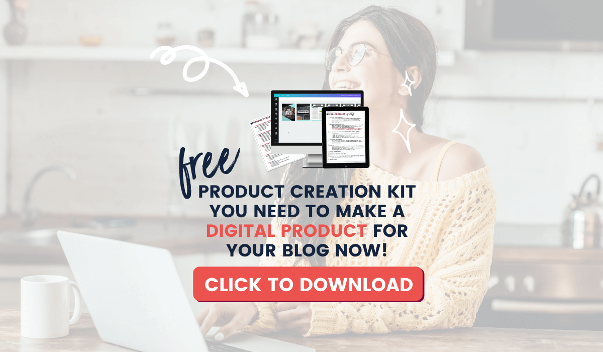
Don’t forget our FREE Product Creators Quickstart Kit! You’ll get a checklist, cheatsheet, and Canva design template to help you nail your launch!
TRY CANVA PRO FREE FOR 30 DAYS
Start your FREE Canva Pro trial today and unlock ALL of their incredible time-saving features that cut your design time to just minutes.
To be honest? It’s the best $14.99/mo OR $119/yr we spend on our business because that time we save with every design is put back into making MORE money in our business!
Leave a Reply