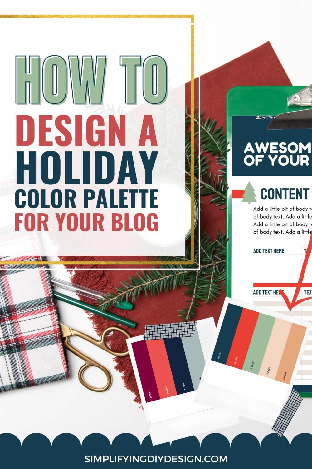
Do you want to create more holiday content without using your brand colors? How do you use holiday colors for your blog without compromising brand recognition? Here’s how to create a holiday color palette that pairs perfectly with your brand personality!
Boost your holiday traffic with our FREE gift guide template! It’s the PERFECT compliment to all of your gift guide posts that’ll be sure to bring in more email sign-ups and affiliate revenue!
Today we’re talking about how we can pick a holiday color palette that complements our brand. The question of the day lately has been:
Table of Contents
“Can I ditch my brand colors for my holiday printables and/or holiday pins?”
In short, yes!
You can and should use a holiday color palette for your seasonal lead magnets and holiday-related content.
There’s just too much opportunity not to take advantage of the holiday traffic to grow your email list and make some serious money from product and affiliate sales.
It would be a shame to miss out on all of that from something as simple as a holiday color palette.
So, if there’s only one thing you can take away from this post, it’s that we highly encourage you to use a holiday color palette!
And if you want to know how to create a holiday palette, we’ve got you covered. But before we jump right into color palettes, there are some key factors to consider.
WANT TO REMEMBER THIS LATER? SAVE IT TO YOUR FAVORITE PINTEREST BOARD! ⬇
You must identify colors that work well with your brand personality and won’t clash with your current color palette.
Meaning there’s a right and wrong way to create a holiday color palette.
Different colors but same brand style
First, we’ll discuss creating a holiday color palette while keeping the same brand style.
Our friend Brittany from Our Home Made Easy has nailed her seasonal content with a beautiful holiday color palette while staying on brand.
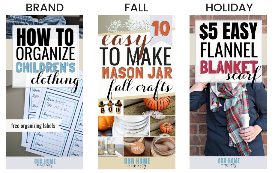
Do you see how the style is consistent, but the colors, while different, complement one another?
- PIN ONE: Designed in her brand style with normal brand colors
- PIN TWO: Orange complements blue for a fall vibe (and the image pulls the orange out even more)
- PIN THREE: This particular shade of red signifies the holidays yet is still complementary
Brittany’s normal blue color is very soft and muted.
So, naturally, she wouldn’t want to pick a bright orange like a traffic cone or a red stop sign shade.
This is a GREAT example of someone who changed absolutely nothing about her pin and brand style other than the seasonal color, and it totally works!
Not only do the colors complement each other beautifully, but the style and layout are exactly the same, as well as the fonts and technique.
Related Post: 5 Awesome Typography Tips to Use in Canva
Overall, Brittany maintained brand consistency perfectly throughout her pins.
Seriously, we can’t get over how amazing they look. And if you still haven’t taken a peek at her blog, you need to. You’ll LOVE her content!
Different colors and brand style
Next, let’s talk about going way off-brand when choosing a holiday color palette.
Here’s an example from our own site. The first two are brand styles we often used—the fonts, techniques, and colors are consistent. While the body styles vary a bit, they’re still on-brand.
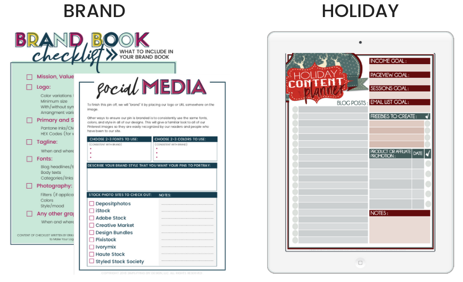
The image on the right is one of our seasonal lead magnets we paired with our holiday-themed blog posts.
Side note: This is a FREE holiday content planner that ties in with our post, Printables You Need to Create for Holiday Traffic.
Notice how it’s COMPLETELY OFF BRAND.
The colors are different, the fonts and techniques are different, and even the checkboxes are circles instead of squares.
Here’s the thing. It’s important to note that this is a seasonal lead magnet for our subscribers, NOT a pin or social media graphic.
Related Post: Seasonal Lead Magnets to Boost Your Email List
They’re already on our list, so maintaining brand recognition isn’t as important here as on Pinterest (because trusted brands get more clicks).
Here’s what the pin for this post looks like:
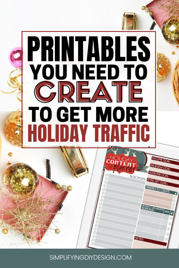
Regarding our pin design, we knew we had to stay consistent with our brand’s style to maintain brand recognition.
This means our readers will still recognize that this pin is from Simplifying DIY Design, even though the colors are vastly different from our regular color palette.
Related Post: Easily Achieve Brand Consistency With Your Blog
The benefit to staying on-brand is that you’ll save time because you don’t have to think as much about the colors, fonts, or layout.
You can even create or purchase a few holiday-themed templates to cycle through, shortening your design time even more.
Choosing a holiday color palette
This is by far the biggest hurdle when it comes to a holiday color palette – choosing the right colors!
If branding our blog wasn’t hard enough, we must come up with another color palette yet again.
Not going to lie; it took us quite a bit of time to develop our new brand for Simplifying DIY Design. We reached a new milestone in our business, and what better way to celebrate than with a facelift!
Unbeknownst to us, we could NOT decide on a color palette for the longest time, so we know how stressful this step can be.
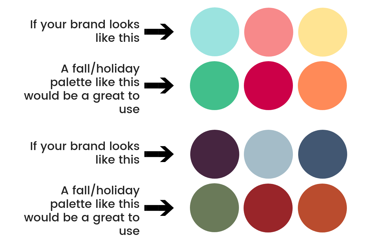
Keep in mind that the suggested colors are for fall (hence the orange) and Christmas. Your color choices will obviously vary if you celebrate or talk about different holidays.
However, the important thing to note here is the shade and overall “feel” of the colors.
Believe it or not, color can actually evoke specific emotions – excitement, the feeling of warmth, even a temporary increase in blood pressure.
Holiday color palettes can be stressful. Preparing your blog for the holiday season shouldn’t be. We’re even sharing our own Black Friday promo guide so you can have the best Q4 yet!
Color Example #1
The first example is a lighter color palette. So, the holiday color palette we chose is also bright, light, and airy.
This color palette gives off a happy, joyful vibe.
Color Example #2
The second example contains darker and muted yet soft colors. The complimentary holiday color palette for this is also darker, softer, and much less vibrant.
This color palette gives off a homey, comfortable vibe.
PRO TIP: If using Canva Pro, create a separate palette for your holiday color palette! Try Canva Pro FREE for 30 days here!
That way, you won’t have to figure out which colors you used last year. Gotta love Canva’s time-saving tools!
To create your brand’s holiday color palette, click ‘Brand’ from the left menu and again on ‘+ Add new.’ Add in each hex code, name it, and you’re all set.
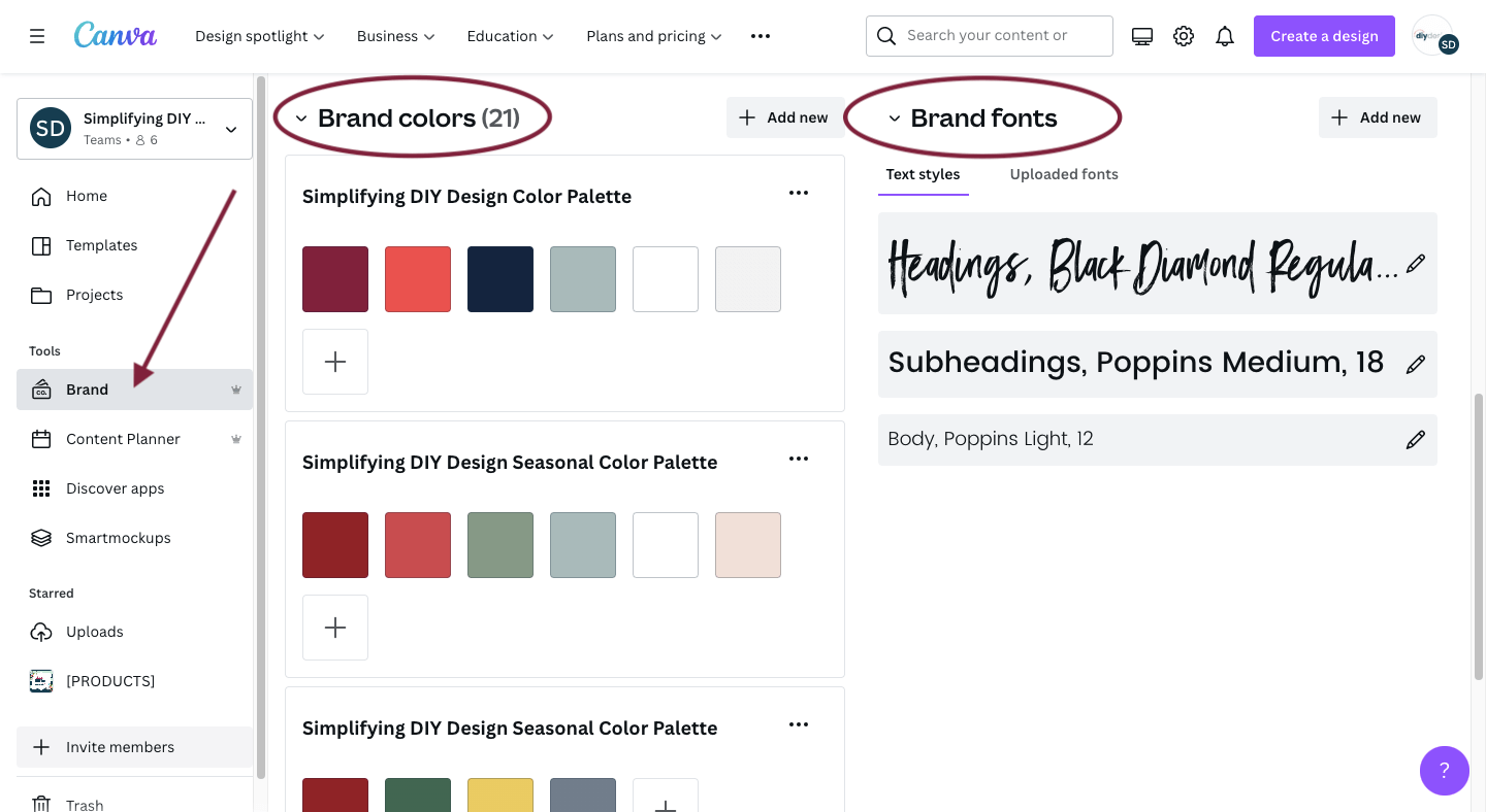
We go much more in-depth on how to setup your Canva Brand Kit and all of the incredible benefits Canva Pro has to offer in this article here.
There’s a super cool design feature we talk about that you can use with your holiday color palette, too!
Use a holiday pattern for inspiration
Another option for building a holiday color palette is to choose a holiday pattern you’ll use in your holiday content and pull colors from that.
For this example, let’s go back to Brittany from Our Home Made Easy.
This is similar to choosing a brand pattern and using it in your products, social media graphics, and website. Instead, we’re choosing a holiday pattern that fits our brand style and pulling colors from that.
This is an example of Brittany’s holiday organizer:
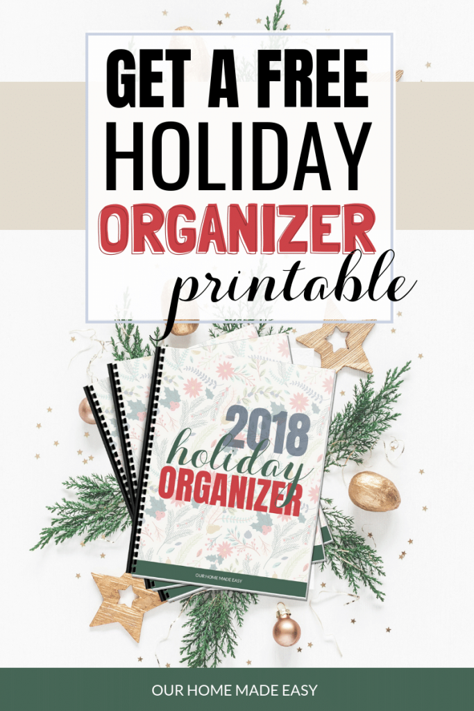
She chose a holiday pattern to use for the cover of her Holiday Organizer and then pulled the hex code of the red and green from that pattern to use for her pin and the product.
Genius, right?
There are several ways to find the hex code of an image.
The EASIEST way is by using ImageColorPicker.com. Upload the image and then click on various parts of the image to generate the hex code. It’s SO easy.
Canva has recently come out with a super cool feature that’ll pick the colors from the photo for you.
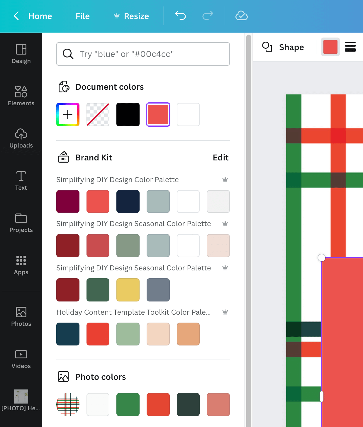
While they may not be absolutely identical (the green is spot-on but the red is a little off), it’s still a great option for building a holiday color palette from your favorite pattern.
Keep a consistent brand style
The best way to keep a consistent brand style is by using the same fonts and style as you usually would for your brand but using a single complimentary seasonal color to accent the image.
You can go really off-brand if you want to. However, we recommend at least keeping that branded style for your social media graphics and pins.
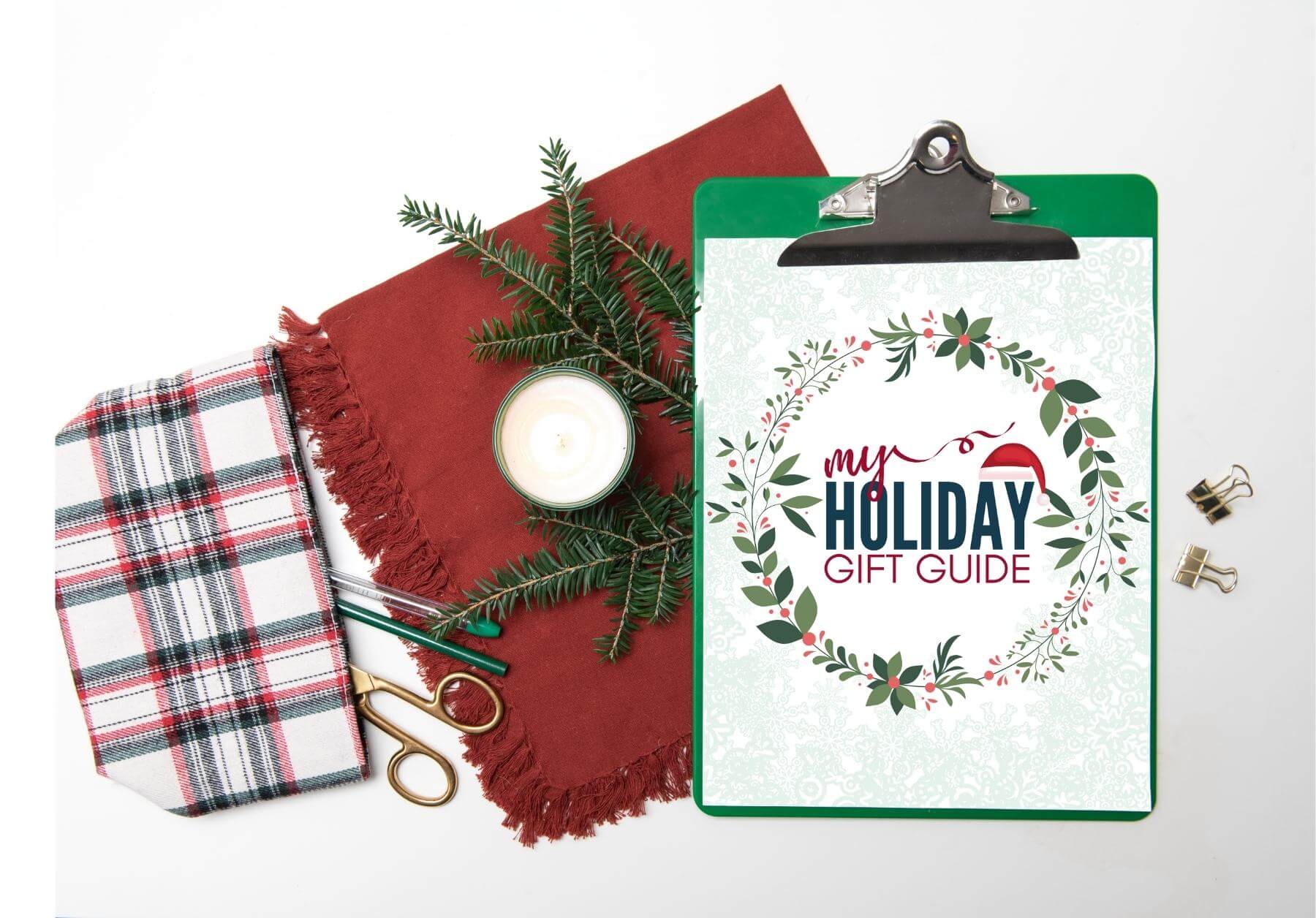
Did you grab our FREE gift guide template? Click here to have it delivered to your inbox by the time you’re finished reading this post!
Printables or holiday products have a little more flexibility, but social media is where having a branded appearance is most important.
Choosing the right seasonal colors and incorporating patterns that pair well with your brand can give your holiday color palette that extra kick!
Seasonal lead magnets and content are GREAT for holiday traffic, so make the most of it!
RESOURCES MENTIONED IN THIS POST:
- How to Leverage the Holidays for Maximum Blog Growth
- Seasonal Lead Magnets to Boost Your Email List
- FREE Holiday Content Planner
- Printables You Need to Create for Holiday Traffic
- ImageColorPicker
- Ultimate Holiday Canva Template Bundle
Don’t forget to grab your FREE gift guide template! It’s the PERFECT compliment to all of your gift guide posts that’ll be sure to bring in more email sign-ups and affiliate revenue!
TRY CANVA PRO FREE FOR 30 DAYS
Start your FREE Canva Pro trial today and unlock ALL of their incredible time-saving features that’ll cut your design time down to just minutes.
To be honest? It’s the best $12.99/mo OR $119/yr we spend on our business because that time we save with every single design is put back into making MORE money in your business!

Ragia says
As a freshly started blogger, I was trying to do something for my blog for the Black Friday event. But I can’t afford all those things entrepreneurs are offering for a few hundred bucks that made me weep. Thank SDIY I can do something without breaking the little piggy bank.
The tax collectors will come along in January. 🤣😒