Do you struggle to make your YouTube thumbnails pop? We’re recreating YouTube’s most popular thumbnail designs using Canva to show you the best layering and font effect techniques to help boost your YouTube clicks and views!
Most of us are suckers for a good dupe, especially when it comes to sticker shock stores like Pottery Barn and Restoration Hardware.
We know that grey modular sectional is absolutely stunning but does it really need to cost $17k? Yeah, no. Que the start to our hunt for product dupes and copycats that’ll give us the same look (and most times the same quality) for a LOT less.
Now, let’s pivot for just a sec because, for some reason, our mindset totally changes when it comes to business.
Why is it that we absolutely positively KNOW (or so we think) that there are no compromises when it comes to products we use in our business?
Ready to launch your digital product? Get our FREE Product Creators QuickStart Kit today! You’ll get a checklist, cheatsheet, and Canva design template to help you nail your launch!
Just because something’s at a lower price point, we automatically think lower quality, minimal features, and a whole lotta headaches. We know; we get the emails saying just as much!
That’s why we decided to show just how powerful Canva really is by recreating the most popular YouTube thumbnail styles using JUST Canva!
It’s so easy to create those eye-catching, almost envious YouTube thumbnails that most bloggers think were designed using a fancy, expensive program like Photoshop or have a team of designers on their payroll.
But with Canva, we can create just about anything, including those jump-off-the-screen YouTube thumbnail designs that draw fast attention from their viewers!
By the end, we know you’ll be saying, “I had no idea Canva could do that!” and maybe even a few wow’s along the way.
REMEMBER THIS POST LATER! PIN IT TO YOUR FAVORITE PINTEREST BOARD! ⬇
Now, before we get started, we need to put out a little disclaimer.
We are NOT recreating these YouTube thumbnail designs for you to create the same exact look. We never have or will condone copycat designs.
We’re simply showing the possibilities of using Canva and how you can use layering and font effect techniques (that used to only be available in programs like Photoshop) to create your own brand’s unique style on YouTube.
Table of Contents
DESIGN ELEMENTS TO CONSIDER
We know we’ve said it before, but we’re going to say it again. Just because you like it doesn’t mean your audience will, and vice versa.
Your designs need to be centered around what your audience finds appealing regardless of how you feel about it. With that, we need to consider a few key elements when designing our YouTube thumbnail.
1. AVOID BLACK AND WHITE BACKGROUNDS
You may feel a certain way about YouTube’s Dark Mode, but that doesn’t necessarily mean your audience feels the same.
YouTube recently announced new updates to the layout based on user feedback to make it “even darker so the colors truly pop on your screen.”
If you’re still not convinced that Dark Mode is as popular as you think it is, here’s a November 2022 article from EarthWeb stating, “81.9% of smartphone users use dark mode.”
So, what does that mean for you?
If you’re using dark colors, your YouTube thumbnails may get lost in Dark Mode’s deep, moody background.
But, if your audience falls in the 19% who still prefer Light Mode, you may want to keep away from the crisp, clean white backgrounds we’ve all come to know and love.
2. KEEP FONTS SIMPLE
Are you really a blogger if you don’t have a dedicated font folder filled with script-style fonts you’ll most likely never use but were too cute to pass up? Thanks, Creative Market’s free goods!
All jokes aside, we know how tempting it is to want to add a playful or unique font to your YouTube thumbnail, but you must resist the urge!
Related Post: 5 Typography Tips | How to Design with Canva Fonts
You want your message to be as clear as possible on ALL platforms, whether they’re viewing on mobile, tablet, or computer.
It would be a shame to miss out on views because your audience couldn’t figure out what your video was all about!
3. MINIMIZE DISTRACTIONS
Getting caught up in fun design elements, layers, arrows, and the like is easy. Unfortunately, this causes your YouTube thumbnail to become cluttered, difficult to understand, and very easy to judge (and not in a good way).
Here’s the perfect quote from Coco Chanel we reference often.
“Before you leave the house, look in the mirror and take at least one thing off.”
But in our case, before we download a design, we look it over to see if there’s one thing we can remove.
When a design is cluttered, it looks messy. When it looks messy, it appears unorganized, making it harder for people to trust you as an expert in your niche.
You don’t need to reinvent the wheel to be successful or draw attention to your graphic. Just because everyone else is doing it on YouTube doesn’t mean your thumbnail will fall into the sea of sameness.
They’re doing these things because it WORKS!
This will make much more sense as we dive into the tutorial because you’ll see a LOT of commonalities even though they look vastly different.
Now that we have the key design elements out of the way, let’s jump into designing a YouTube thumbnail!
YOUTUBE THUMBNAIL DESIGN
For this tutorial, we’ll be recreating the most popular (and most requested) YouTube thumbnail styles, which has raised many questions about how and if you can design it in Canva.
And we’re here to tell you that’s a big ol’ YES.
Please note that this tutorial uses a design feature only available for Canva Pro users. You can try out Canva Pro FREE for 30 days here!
If you’re on a budget, you can easily remove backgrounds using the Magic tool inside Preview. For PC users, pixlr.com is a great alternative.

These are by far the most popular YouTube thumbnail styles because they cover all the bases.
- High-quality photo (studies show you’re more trustworthy when viewers can see your face)
- Clear and concise text that summarizes your video
- Layers that make the thumbnail jump off the screen
- Easy to read on ALL platforms
See what we mean by incorporating all the key design elements (no white/black background, easy-to-read fonts, and minimal distractions) yet looking completely different from one another?
DESIGN #1
Let’s start with the first example from AmandaOutside.
In Canva, select the pre-sized ‘YouTube Thumbnail’ (1280px X 720px) to start. Then, upload your main photo twice and move it right on top of each other. Don’t worry about the final placement just yet.
We’ll remove the background from the top photo and blur the bottom photo. To start, highlight (click) the top photo and click ‘Edit Image’ from the top left and again on ‘Background Remover.’
Please note that the ‘Background Remover’ tool is only available for Canva Pro users. You can try out Canva Pro FREE for 30 days here!
Next, hold down the Cmd key (or Ctrl if using a PC) and click on the top photo twice. This will select the bottom photo.
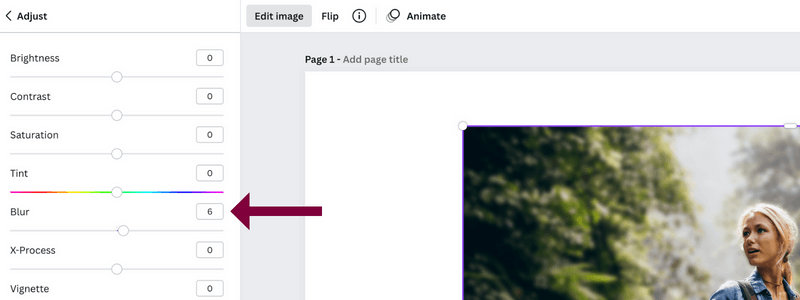
Then go to ‘Edit Image’ –> ‘Adjust’ –> ‘Blur.’ Generally, levels 4-6 look best depending on how clear the original photo is.
Now we can click and drag our mouse over both photos to move them simultaneously into the right spot.
Next up, ‘Glow.’
There’s a faint dark glow around Amanda which can be easily created in Canva. Select the top image once more and click ‘Edit Image’ –> ‘Shadow’ –> ‘Glow.’
To customize the glow, click on ‘Glow’ again.
Here we can change the ‘Size’ (how far out the glow expands), ‘Transparency’ (thickness of the glow), and ‘Blur’ (harsh line or fades out).
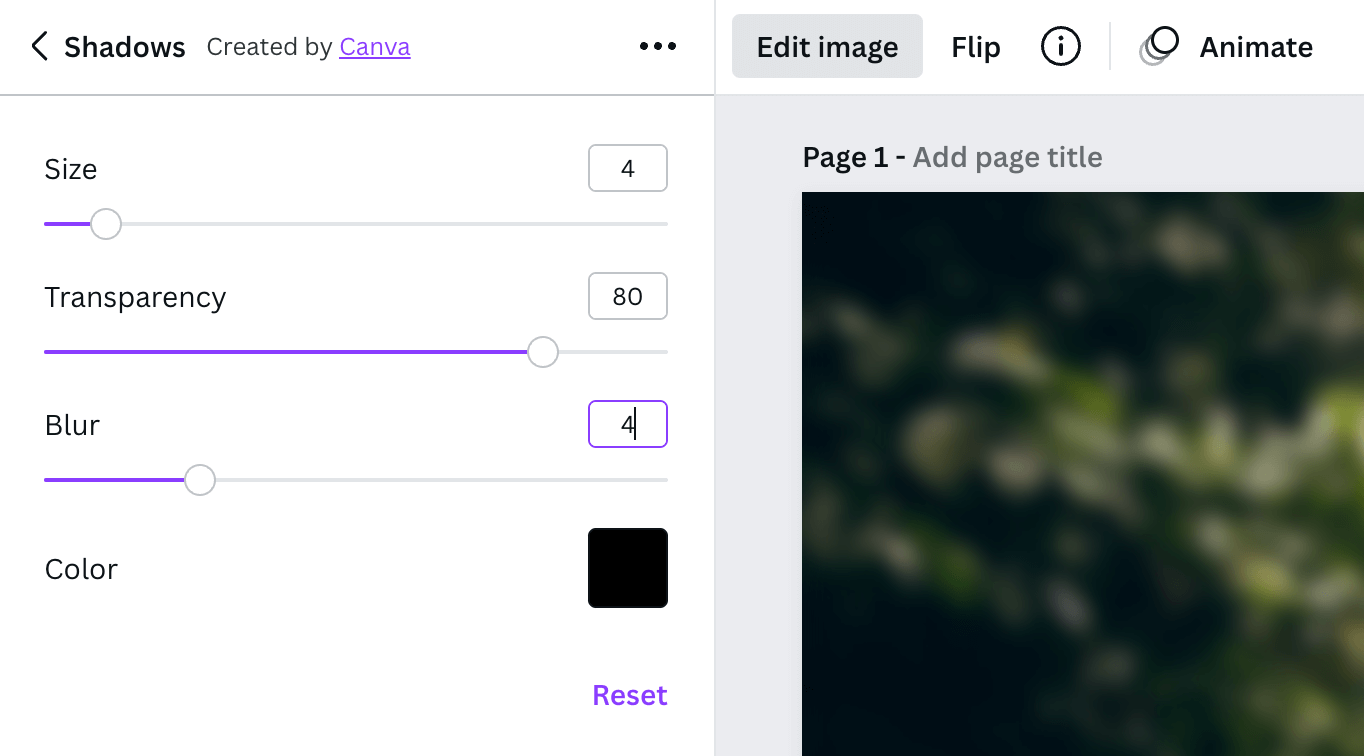
For this design, we’ll set the ‘Size’ to 4, ‘Transparency’ to 80, and ‘Blur’ to 4.
It’s now time to add some text!
This YouTube thumbnail design uses two different text effects – ‘Shadow’ and ‘Splice. As of right now (January 2023), you can only add one text effect per text block.
No worries, though; we’ve got a workaround!
We’ll first use the ‘Splice’ text effect.
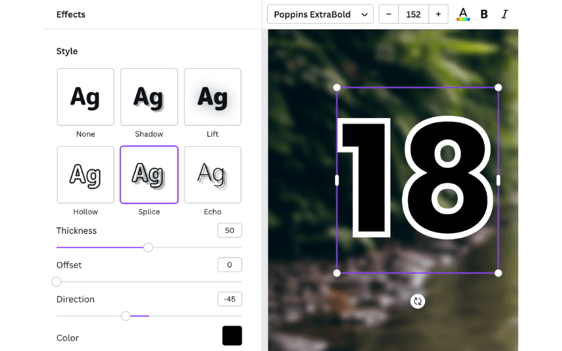
To create the ‘Shadow,’ copy that same text box, and center it over the previously designed text.
While that text box is still highlighted, click ‘Effects’ –> ‘Shadow.’ We’ll go with an Offset of 42, Direction of 0, Blur of 46, and Transparency of 100.
We changed the ‘Shadow’ to red so you can see what it looks like since the outdoor image we chose is a bit darker in that area.
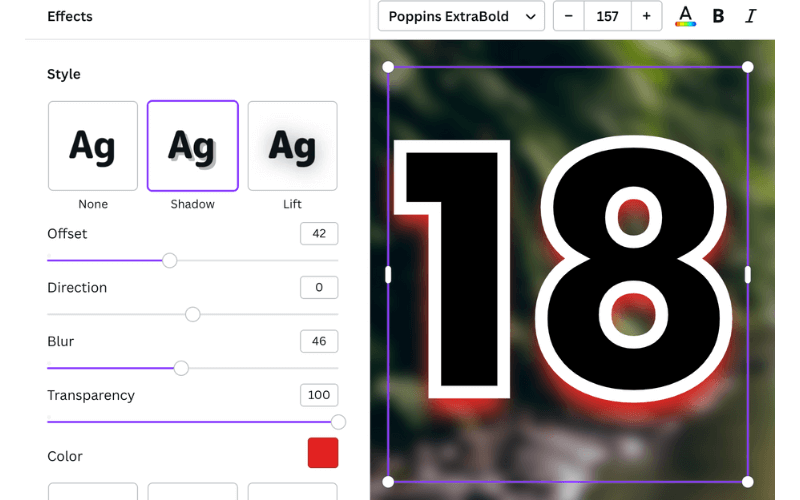
Now it’s time to move it behind by selecting ‘Position’ from the top right, followed by ‘Backward.’
KEYBOARD SHORTCUT: You can also use Cmd + [ (to move back one) or Option + Cmd + [ (to move all the way back)
For the ‘GIFT IDEAS’, ‘for’, and ‘campers & hikers’ text blocks, we’ll follow the same process as that of our number 18 but with a wider border.
Instead, we’ll go with a ‘Thickness’ of 80 whilst keeping the same ‘Offset’ of 0 and ‘Direction’ of -45.
In total, we have four main individual text blocks and an additional four (set behind) to create the ‘Shadow.’
Lastly, add and position two ‘Square’ elements behind the bottom text block to make it ‘campers’ and ‘hikers’ pop.
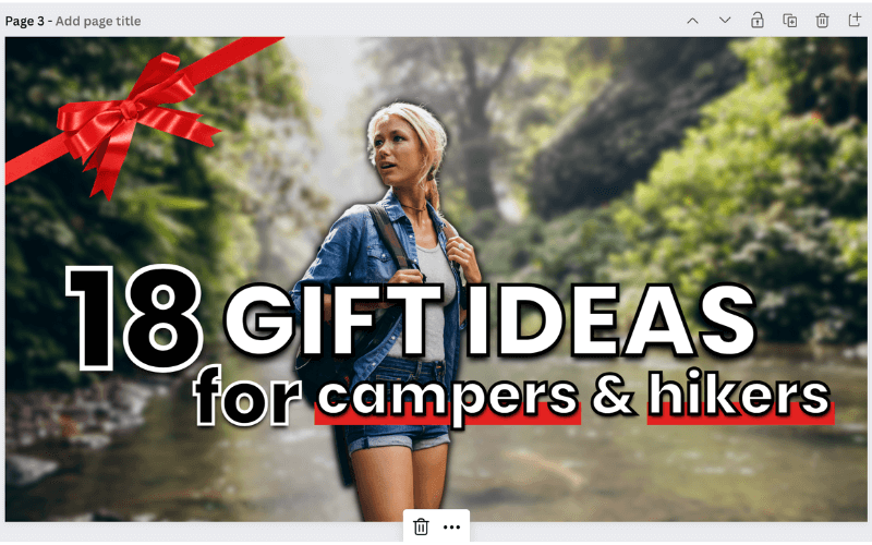
Then, we’ll swap out the color for a festive red and finish it with a ‘red gift ribbon and bow’ element in the top left corner to complete the look!
DESIGN #2
The second YouTube thumbnail we’ll recreate is from SarahBethYoga.
We LOVE her thumbnail style with her big b-o-l-d text and an image that clearly depicts a yoga pose without giving it a second thought.
First, we need to find a geometric image for the background. The ‘Abstract blue geometrical background’ from Natrot has the perfect amount of dimension. We’ll adjust the color by clicking ‘Edit Image’ –> ‘Photogenic’ –> ‘Noir.’
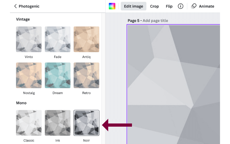
Now it’s time to place our teal-colored ‘Square’ element with a transparency of 85 right over our background. Lookin’ great so far!
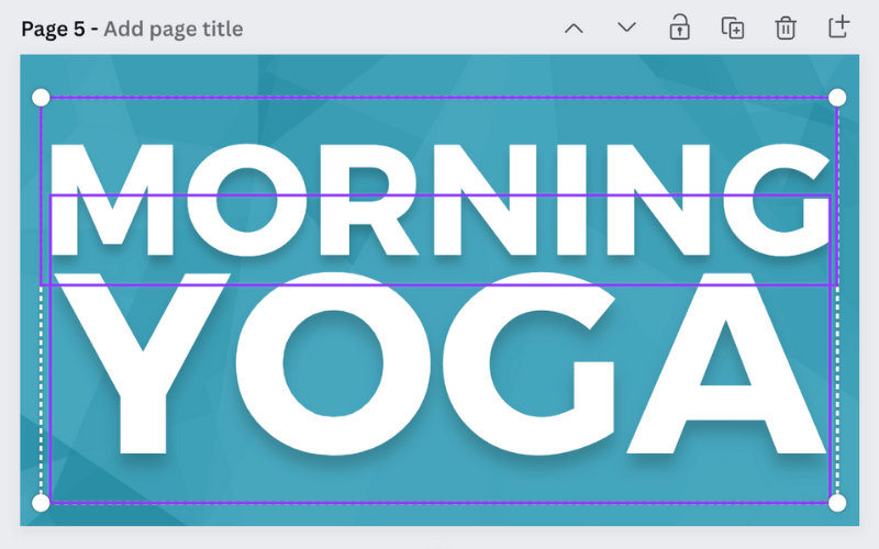
We’re now ready to add our two textboxes so we can size the smaller word (in this case, ‘yoga’) in line with the larger word, ‘morning.’
Once that’s lined up, we need to add a subtle ‘Shadow’ effect to both lines of text. We’ll use the same levels as our first example, except we’ll reduce the Transparency to 20 for a lot less depth.
The next thing we’ll tackle is the yoga pose. Once that’s lined up, we’ll remove the background using the ‘Background Remover’ tool under ‘Edit Image.’
Please note that the ‘Background Remover’ tool is only available for Canva Pro users. You can try out Canva Pro FREE for 30 days here!
SarahBeth has a slight glow to her transparent image, which can easily be added by selecting the image and clicking ‘Edit Image’ –> ‘Shadows’ –> ‘Glow.’
Click ‘Glow’ once more to change the Size to 6, Transparency to 90, Blur to 7, and swap the black with white. Perfect.
To create the time block at the top left, we’ll start with the ‘Square’ element by Canva. First, click on the color block at the top left and then again on the transparent block with the red diagonal line.
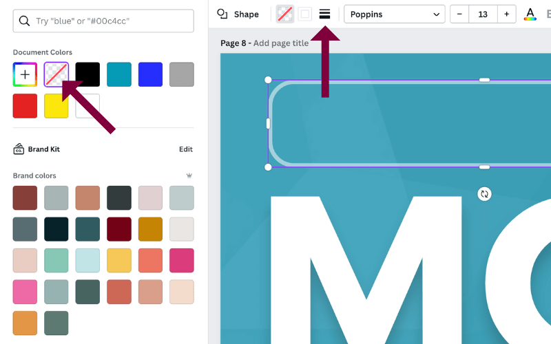
Next, we need to add a border. Click on the ‘Border Style’ box (3 horizontal lines) to the right of the color block and adjust the ‘Border width’ to 4 and ‘Corner rounding’ to 25.
Lastly, we’ll reduce the transparency to 50 (checkered box at the top right), so it’s not so pronounced.
Now that our bordered box is complete, all that’s left is to add a small text box (with a Transparency of 80) and a ‘Clock’ element by Google Design Icons, and we’re ready to go!
Related Post: How to Create Textured Font in Canva
Fonts used within the design are Montserrat Classic (bold text) and Neue Einstellung (time text).
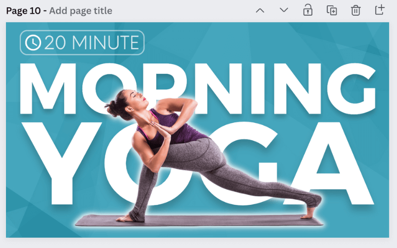
That looks so good. SarahBeth has such a great YouTube thumbnail style, don’t you think?
DESIGN #3
Our third and final example is from Danielle Kirsty.
This is our favorite style of the three because it checks off all the boxes; high-quality photos, clear and minimal text, and layers make it more two-dimensional.
It tells a story, thee story using only imagery. It’s brilliant!
Regardless of the true crime story, Danielle is the star of the show, so our replica photo needs to be front and center.
Next, we’ll remove the background using the ‘Background Remover’ tool under ‘Edit Image.’
Please note that the ‘Background Remover’ tool is only available for Canva Pro users. You can try out Canva Pro FREE for 30 days here!
Now let’s add a glow by clicking ‘Edit Image’ –> ‘Shadow’ –> ‘Glow.’
We’re going to crank up the levels, so click on ‘Glow’ again and set the size to 12, transparency to 100, and blur to 20. Lastly, we’ll swap the standard black with a beautiful robin’s egg blue.
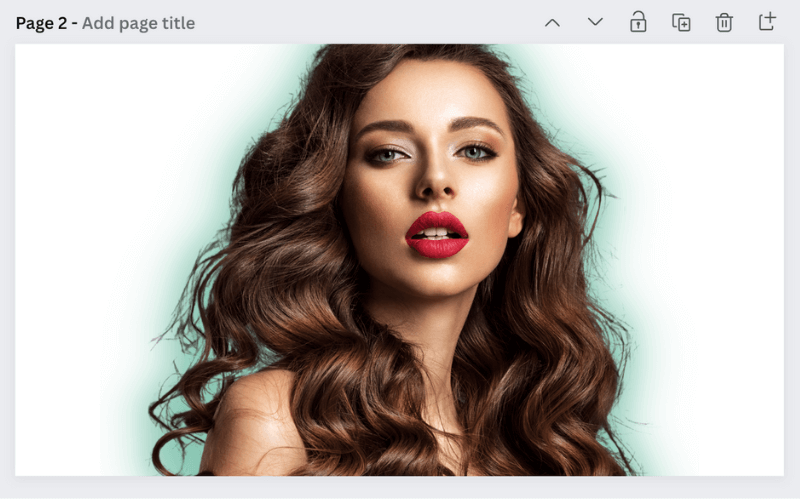
Now for the layers!
We need four additional photos to replicate this YouTube thumbnail – a news article, stock image, and two people.
Instead of all doom and gloom, we’re going to tell our own story with two people getting together and creating an equine sanctuary!
We’ll upload our news article (that we found by Googling “good news article”) and angle it to fit the space at the top left.
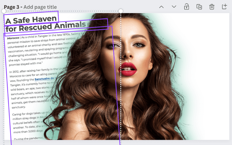
Next, we find a super cheery girl who will play an important role in our fictional animal rescue story. We’re going to follow the same routine as our makeup artist; remove the background (‘Background Remover’ tool) and add a Glow (using ‘Shadow’), but this time, we’ll keep the glow minimal.
Don’t forget to move all images behind our makeup artist by highlighting (clicking and dragging over the images/elements) and then selecting ‘Position’ from the top right and ‘Backward’ or ‘To back.’
Now we’re on the right side of our YouTube thumbnail.
We’ll add the other counterpart of our story by again, removing the background and adding a ‘Glow.’ In Danielle’s YouTube thumbnail, the glow on the right is much more pronounced than on the left.
We think a ‘Size’ 8, ‘Transparency’ of 95, and a ‘Blur’ of 4 should do the trick.
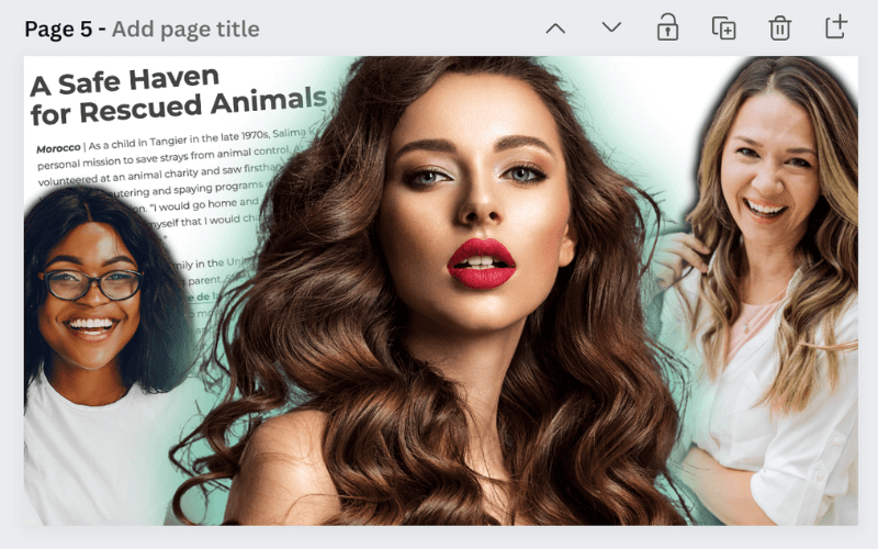
Lastly, we’ll take a stock photo of some horses to tie our fictional story together.
To finish, we need to add Danielle’s signature black and yellow text at the bottom.
First, we’ll add a basic ‘Square’ element and change the set color to yellow. Next, we’ll include a textbox using the Horizon font and a letter spacing of about 50.
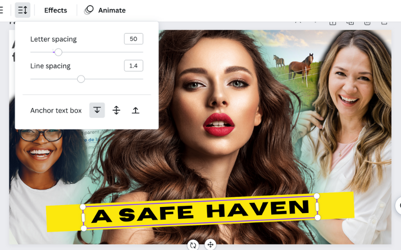
Now here’s the tricky part.
We need to get a bit creative when it comes to the dark shadow around the yellow box to help make it pop. We had to use the ‘black blur’ element from Olhar de Alice in a row of four to get the length we needed.
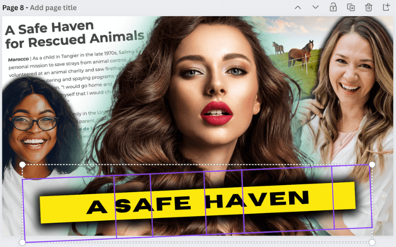
Group them together by highlighting all four design elements and clicking ‘Group’ at the top right. This makes moving and adjusting much easier to get the angle just right.
And there you have it. The perfect recreation of one of the most popular YouTube thumbnail styles using Canva!
Hopefully, this tutorial gave you the creative boost you needed by seeing just how easy it is to create YouTube thumbnails that pop!
Use these layering and font effect techniques to create your own brand’s unique YouTube thumbnail style, and watch your clicks and views soar.
What designs would you love to see us recreate using ONLY Canva? Drop them below or send us an email at hello[at]simplifyingdiydesign[dot]com.
We’d love to show you just how powerful (and easy) designing in Canva truly is!
RESOURCES MENTIONED IN THIS POST:
- FREE Product Creators QuickStart Kit
- Canva
- How to Design with Canva Fonts
- Pixlr
- How to Create Textured Font in Canva
Don’t forget our FREE Product Creators Quickstart Kit! You’ll get a checklist, cheatsheet, and Canva design template to help you nail your launch!
TRY CANVA PRO FREE FOR 30 DAYS
Start your FREE Canva Pro trial today and unlock ALL of their incredible time-saving features that cut your design time to just minutes.
To be honest? It’s the best $12.99/mo OR $119/yr we spend on our business because that time we save with every design is put back into making MORE money in our business!

Leave a Reply