Making an income with your blog is much easier with a well-designed blog. If your blog isn’t keeping visitors around, chances are it’s the design. Check out these top blog design tips to boost your retention rates!
Have you ever landed on a blog and had a little design envy? Their website just screamed ‘PRO BLOGGER,’ right?
You instantly thought, ‘They’re definitely making money with their blog for sure. No doubt about it!’
The thing is, ANYONE can have a professional-looking blog.
Yes, even the no-budget beginner bloggers! How do we know? Because we did it!
That’s one of the reasons we love design SO much. You can make something out of absolutely nothing if you focus on the right things.
Sign up for our FREE Blog Graphics That Convert video training so you can learn how to create beautiful graphics for your blog that’ll increase clickthroughs, SEO, sign-ups, and sales!
If you’re new to the blogging world or have a blog that doesn’t seem to retain visitors, chances are it’s your blog’s design.
The good news is that this is something you can easily fix without spending a dime. The bad news?
Just kidding, there’s no bad news!
REMEMBER THIS POST LATER! PIN IT TO YOUR FAVORITE PINTEREST BOARD! ⬇
Keep in mind that some of the blog design tips we’re about to recommend will depend on your website’s theme.
If you’re using a fancy or complex theme, we highly recommend switching to the (free!) Kadence WP theme.
If we didn’t have a beautifully-customized theme by the amazingly talented Pixel Me Designs, this is the exact theme we’d use. It’s HIGHLY recommended by SEO analysts because it’s built for performance.
Now, we get it. The animations and unique fonts on some of the themes out there make for a stand-out blog.
But there’s a reason that successful blogs have a simple website, and we’ll go over the why in just a moment.
Okay, enough of the red tape. Let’s jump into the 10 essential blog design tips that’ll have you looking like a pro blogger in no time!
Table of Contents
- 1 USE A BRAND COLOR PALETTE
- 2 ONLY TWO COMPLEMENTARY FONTS
- 3 CLEAR IMAGES
- 4 LIMITED NAVIGATION MENU
- 5 MOBILE-FRIENDLY SITE
- 6 THEME FOR DESIGN ELEMENTS
- 7 TEXT IS BROKEN UP VISUALLY
- 8 CALL-TO-ACTION IS ABOVE THE FOLD
- 9 ALL LINKS WORK
- 10 SOCIAL ACCOUNTS ARE CONNECTED
- 11 THESE ARE JUST 10 BLOG DESIGN TIPS TO GIVE YOU THAT PRO BLOGGER LOOK.
- 12 RESOURCES MENTIONED IN THIS POST:
- 13 TRY CANVA PRO FREE FOR 30 DAYS
USE A BRAND COLOR PALETTE
As a new blogger, we completely understand the urge to want to try everything and anything to see what sticks, including color palettes.
Or maybe you’re just so obsessed with colors that you want your readers to taste the rainbow as they navigate through your site. Both are no-gos, and here’s why.
If you change your brand’s color palette too much, it not only creates confusion amongst your readers but lowers their confidence in you, too.
It tells them what you were doing before wasn’t working, so you’re trying something else. That doesn’t really scream ‘pro blogger,’ does it?
Related Post: How to Choose the Perfect Colors For Your Blog
Now let’s chat about the latter.
All of your pages should have a similar feel, and color is one of the design elements that’ll bring your content together. As visitors click from page to page, your site should flow effortlessly, as if it’s telling a story.
If one page is designed using rich, earthy tones and the next looks like a Skittles bag exploded on their screen, they’ll leave without ever thinking twice about you.
ONLY TWO COMPLEMENTARY FONTS
Are you really a blogger if you don’t have a Google Drive folder filled with hundreds of fonts from Creative Market’s weekly free drop, or the massive 700+ font bundles you got for an incredible steal of only $2.99?
It seems font hoarding has become part of a blogger’s nature, even though we KNOW we’ll never use them.
All jokes aside, it’s tempting to use one of those crazy script fonts that we just can’t get enough of all over our website. It’s just so darn cute, and we want others to ooh and ahh in all its beauty.
But that isn’t always the best thing to do. In fact, we don’t even recommend it.
We recently got an email from a reader asking why her site wasn’t retaining traffic. As soon as we saw her blog, we instantly knew why.
While she did follow a basic design rule of only using two fonts, she used them in all the wrong ways.
Instead of using a Sans Serif font as the primary font for her site (because it’s easy to read), she used a script font for nearly everything.
- Blog’s navigation menu
- Main text throughout the site
- Blog post headers
- Logo
We could barely read the text on a desktop, let alone a mobile device. That’s why her bounce rate was so high!
When designing your blog, use up to two complementary fonts; one Sans Serif and one Serif works best.
Related Post: Easy Typography Tips Every Blogger Should Know
Be sure to use an easy-to-read Sans Serif font like Lato, Montserrat, or Roboto as your blog’s main font, at least. While our brand fonts are Poppins (Sans Serif) and Black Diamond (script), we ONLY use Poppins on our website.
We’d much rather have an easy-to-read website that keeps our readers engaged versus a “pretty” website that doesn’t make any money.
CLEAR IMAGES
Having clear images can be challenging, especially when compressed to the recommended size of <100kb, to keep your site running efficiently.
But blurry or poor-quality images on your website are a dead giveaway that you’re a beginner blogger.
Level up your game by ensuring your images, whether your own or stock, are crisp and well-lit.
When we first started Simplifying DIY Design, we used DepositPhotos for ALL of our stock photos. The quality was top-notch, the variety was great, and the price was comparable to other memberships.
However, we’ve since cut out all of our stock photo memberships (saving us hundreds of dollars a year) by upgrading to Canva Pro!
They have 60 million images to choose from – more than we could ever use in our lifetime! See for yourself with a FREE trial of Canva Pro!
Because visuals play such a vital role in the success of your blog, We cannot stress enough the importance of using high-quality images throughout your blog.
Related Post: 5 Reasons Why You Need Great Graphics to Grow Your Blog
If you do nothing else, improving your images alone can make a huge visual impact, keeping visitors on your site longer!
LIMITED NAVIGATION MENU
It’s easy to get carried away with your blog’s navigation menu.
We don’t want our visitors to miss anything or have difficulty finding what they want. But just like having too little of something is a bad thing, so is having too much.
If you give your reader too many options, they’ll most likely become overwhelmed and not go anywhere on your site except out.
Look at your blog’s navigation from a new reader’s perspective. What would you want them to find first?
Keep your navigation to around five options. This will keep the top portion of your website clean and uncluttered.
You’ll also likely see your visitors clicking their way through multiple website pages instead of coming to your home page and leaving, which is great for SEO!
People come to our site for one of three things – Our content, design templates, and free resource library.
Personally, every blog should have ‘Contact’ on its navigation menu. You don’t want to make your readers jump through hoops to reach out with a question. You never know if it’ll be a lost sale!
We recently added ‘Login’ to our blog’s navigation which has significantly cut down on course login emails which means we’re now spending less time in our inbox!
Another popular option is adding an FAQ page. This is a fantastic option for selling goods and/or services.
MOBILE-FRIENDLY SITE
This is yet another reason why you need to use a top-notch website theme. If your theme isn’t mobile-friendly, no one will hang around and read your content, much less sign up for your email list.
Having a mobile responsive website will:
- Load faster, improving SEO
- Provide a better user experience (easier to navigate and read!)
- Boost your session duration (time spent on your site)
- Lower your bounce rate (leave after viewing one page)
Stupid Simple SEO recommends the Kadence WP theme (it’s free, by the way) because it still looks great no matter how you customize it without compromising your load times.
Related Post: Top Visual Elements for a Brand New Blog
Any time you create a page, write a blog post, or make any design changes to your website, view it on a mobile device to ensure it still looks and functions beautifully for your readers.
THEME FOR DESIGN ELEMENTS
If your website theme allows for some design elements like an arrow here or a scribble there, be sure to keep it consistent across your site.
Design elements are a great way to add your brand’s personality to any visual. But there comes a point where they can become distracting and, at times, distasteful.
You don’t want your website to become disconnected and amateurish.
Just like an outfit, if you have too many things going on, you’ll look like a hot mess. If you’re going to use design elements, keep the style consistent.
A great way to help with this is using only watercolor designs or hand-drawn icons, for example. Creative Market makes this super easy with their design element bundles.
If you find a design element you like on Canva, you can search by artist to see if they have similar style elements to use together.
TEXT IS BROKEN UP VISUALLY
If only we could’ve written our term papers like we do blog posts. We’d never have to worry about stretching it out to 12 pages again because you’d just start a new paragraph after every sentence or two!
Regarding your blog, it’s very intentional.
When you break up your text using white space, images, bullet points, or different-sized fonts like headers, it gives the eye a break.
It also gives the appearance that the content is easily digestible, keeping your readers engaged longer.
Heavy blocks of text can be visually overwhelming, especially with our insanely short attention span these days. The key to great design, whilst still incorporating your content, is by breaking it up.
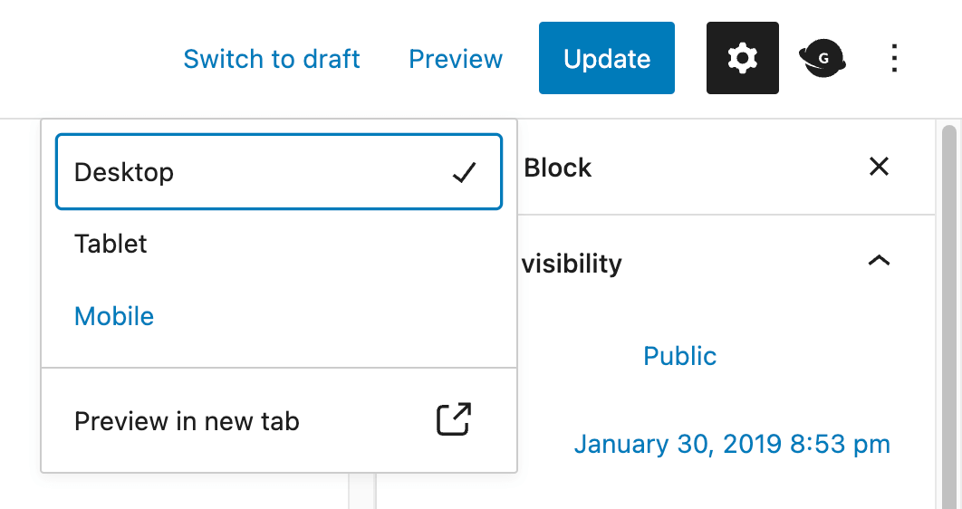
We always preview our blog posts from both a desktop and mobile perspective in WordPress to see if there are any areas that look to be a bit too much.
An engaged reader stays on your site longer, significantly increasing your chances of gaining a new subscriber and, ultimately, a new sale!
CALL-TO-ACTION IS ABOVE THE FOLD
When visitors come to your website, you should have a primary goal, whether that’s to get them to sign up for your email list, buy your bestselling product, enroll in your next webinar, etc.
We know you want them to do everything, but that’s unrealistic. If you’re a beginner blogger, focus on growing your email list first and foremost.
The money is in the list. You own your email list – no algorithm “updates” or account closures will change that.
When you…
- Launch a product, you email your list
- Promote an affiliate product, you email your list
- Need feedback on what product to make, you email your list
- Want to offer a beta program, you email your list
Your email list is your blog’s bread and butter!
Give us a minute as we come down from our soap box. Our knees aren’t what they used to be.
Now that you know what your call-to-action (also known as CTA) will be, let’s chat about what it means to be above the fold.
‘Above the fold’ is the top of your homepage before scrolling down. It’s the first thing your visitors see before doing anything else, so you must make it count.
We have our free design library loud and proud above the fold because we make our money through our email list. People like to try out our Canva templates first before buying, so we rely on our email funnels to do the selling for us.
And we can’t do that unless they’re on our email list, so we need to promote it every chance we get. Make sense?
ALL LINKS WORK
Anytime you change a link to an already published post/page and had linked that original URL somewhere on your site, you’ve just created a broken link.
While it will cause some frustration with your readers, it’ll also affect your ranking on Google and Pinterest (if a pin is linked to the old URL).
The thing is, search engines and Google and Pinterest are not fond of broken links because it ultimately creates a bad experience for THEIR users.
If we’re on Pinterest looking for DIY dog toys and click on your pin, we expect to go to your blog post that teaches us how to create toys for our dogs.
But let’s say you changed the URL and never added a redirect that takes visitors from the old URL to the new one, and we close Pinterest out of frustration. Not only did you lose a visitor, but Pinterest did as well, which is how they make their money.
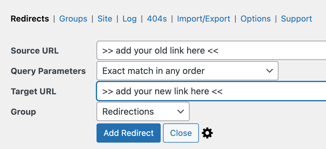
Whenever you change a link on your blog, make sure you update it through a redirect plugin like ‘Redirection.’
Or if it’s something simple like an Instagram handle change, just update it directly in your social icons (usually a widget), which will vary based on your blog’s theme.
DESIGN TIP: Create a branded 404 page that links to popular pages on your site. That way, visitors are likelier to stick around and not just leave.
We also recommend using the ‘Broken Link Checker‘ plugin so you don’t have to spend time going through your site and clicking on all the things just to make sure everything still works.
Anytime there’s a broken link on your site, this plugin will not only let you know its source (like from a blog post or your navigation menu) but give you the ability to correct it all from one place.
Also, be sure to use ‘Pretty Links‘ for all of your affiliate links as soon as possible.
Brands sometimes change their affiliate hosts, meaning you’ll have to update your affiliate links to still receive a commission. By using Pretty Links, you have to update your link ONCE versus going through your entire blog, which can take days!
SOCIAL ACCOUNTS ARE CONNECTED
You probably spend just as much time on social media as you do on creating content for your blog.
Five minutes of scrolling can easily turn into an hour (if not more) pretty darn quickly!
Make sure that your visitors can easily follow you on all of your favorite social accounts by connecting them to your blog. Add the social icons wherever your website theme allows, like in your header, sidebar, footer, etc.
Again, this will depend on your blog’s theme and available widgets. Make sure the color is consistent with your brand’s color palette and that all links work!
We can’t tell you how many times we went to follow someone on Pinterest or Instagram directly from their site, only to find out it’s still linked to the theme’s demo account. Whoopsie!
THESE ARE JUST 10 BLOG DESIGN TIPS TO GIVE YOU THAT PRO BLOGGER LOOK.
As long as you have these boxes checked, you’re well on your way to having a beautifully functioning blog that’s sure to set a lasting impression on your visitors.
Again, some of these are easier to implement than others, such as the mobile-friendly option, but all are important to the success of your blog!
RESOURCES MENTIONED IN THIS POST:
- FREE 30-day trial of Canva Pro
- Confidently Canva
- Canva Tricks Every Blogger Should Know
- Kadence WP theme
- Five-Minute Brand
- How to Set Up Your Brand Kit for Maximum Efficiency
Don’t forget to sign up for our FREE Blog Graphics That Convert video training so you can create beautiful graphics for your blog that’ll increase clickthroughs, SEO, sign-ups, and sales!
TRY CANVA PRO FREE FOR 30 DAYS
Start your FREE Canva Pro trial today and unlock ALL of their incredible time-saving features that cut your design time to just minutes.
To be honest? It’s the best $12.99/mo OR $119/yr we spend on our business because that time we save with every design is put back into making MORE money in our business!
Trevor Hall says
My son has a new company and really needs to get a nice looking website up. I agree that having clear images is absolutely necessary when you have a professional sight. I’ll share your article with him so that he can get an idea of how he wants his website to look.
karafidd says
I’m glad it was helpful! Good luck to your son!